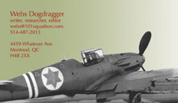
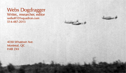
Business cards
It's time to get some. I like the effect of the colour gradient and the olive/red colour combination is my brand now, I suppose, so I should keep it.
I have two designs in mind, one with an aircraft photo and the other with a stylized aircraft. I like the aircraft motif because it will pique curiosity and it's memorable. That's all you can ask for from a card.
Which style do you like better? I can always refine the design somewhat (one concern is the Star of David, for example), but I would like advice if you have any. Which style do you like better?
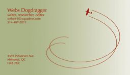
And now, a third option after some feedback elsewhere:
We value your opinion.
(The address and phone number on the cards are not real, for now.)
Bonus elucidation:
Original I had JPEGs in CMYK mode posted here, copies of the layered files I had saved for CMYK printing. Windows browsers could not read those files, so I resaved them in RGB mode and now they show up fine.
I have two designs in mind, one with an aircraft photo and the other with a stylized aircraft. I like the aircraft motif because it will pique curiosity and it's memorable. That's all you can ask for from a card.
Which style do you like better? I can always refine the design somewhat (one concern is the Star of David, for example), but I would like advice if you have any. Which style do you like better?
And now, a third option after some feedback elsewhere:
We value your opinion.
(The address and phone number on the cards are not real, for now.)
Bonus elucidation:
Original I had JPEGs in CMYK mode posted here, copies of the layered files I had saved for CMYK printing. Windows browsers could not read those files, so I resaved them in RGB mode and now they show up fine.
posted by Webs at
12:57 PM
![]()


2 Comments:
webs -
The designs do not reflect your lustry coolness.
Number 2 is a nice enough design, but the color is so bland...it's like announcing to the family, "Tonight, we're having BREAD for dinner!"
Everyone looks up, gives you a blank stare and says, "And what else, dad?"
Use more exciting colors and avoid the gradients - they tend to look amateurish.
wily
Awww... I sorta like the gradient... I guess it depends on the quality of the print...
I'd go with the first option. Star of David is just a historical fact. However, that card would only work for 101-related business. Otherwise, well... I sorta agree with Wily. You can do better.
Load up the photoshop!
Post a Comment
<< Home